How I Built a VI System — The Asymmetric Harmony Between Design and Code
Starting from two PNGs, a complete record of auto-generating a full brand visual identity system with Python.
1. What Is a VI? Why Bother?
VI (Visual Identity) is a brand's "visual language ruleset" — the standard for how it communicates outwardly. It answers one core question: When this brand appears anywhere, what should it look like?
A complete VI kit includes at minimum:
| Category | Contents |
|---|---|
| Logo master | Original transparent version, versions on various backgrounds |
| Logo variants | Horizontal, vertical, square, circle |
| Colour palette | HEX / RGB / CMYK specs |
| Typography rules | Primary and secondary fonts, size recommendations |
| Usage guidelines | Clear space rules, prohibited uses |
| Application examples | Business card, letterhead, social media avatar |
Without a VI, every designer, engineer, and marketing person "improvises," and the brand gradually loses its shape. With a VI, a single folder lets anyone produce consistent brand output.
2. The Starting Point: Two PNGs
The only raw materials for this project were two PNGs:
![]()
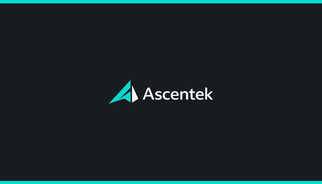
Both images are the Ascentek brand logo — same content but slightly different dimensions (one is a 16:9 display version, the other is more compact).
Logo composition breakdown:
- Left side: Paper plane / A-shaped arrow symbol, made of two triangles
- Main triangle: Teal (
#03dcd0) - Dark triangle: Near-black (
#181c20), creating depth/dimensionality
- Main triangle: Teal (
- Right side: "Ascentek" brand name in a dark sans-serif typeface
- Background: Transparent (RGBA)
These two pieces of information are the foundation of the entire VI: shape + colour.
3. Extracting Brand Elements
3.1 Colour Extraction
No guessing by eye — the script reads dominant colours directly from pixels:
python
def get_dominant_colors(img, k=3):
    # Filter transparent pixels, only analyse content areas
    pixels = [px[:3] for px in img.getdata() if px[3] > 0]
    # Cluster using Pillow's Adaptive Palette
    small = Image.new('RGB', (len(pixels), 1))
    small.putdata(pixels)
    pal = small.convert('P', palette=Image.ADAPTIVE, colors=k)
    return pal.getpalette()[:k*3]
Extracted results:
| Role | HEX | RGB | CMYK (reference) |
|---|---|---|---|
| Primary | #03dcd0 | 3, 220, 208 | C99 M0 Y5 K14 |
| Secondary | #204b4c | 32, 75, 76 | C58 M1 Y0 K70 |
| Dark / Text | #181c20 | 24, 28, 32 | C25 M12 Y0 K88 |
3.2 Icon Boundary Detection
The logo is a combined "symbol + text" image. To create square/circle container variants, the symbol must be isolated.
Challenge: No manual pixel-counting — the script must automatically find where the symbol ends and the text begins.
Initial approach: Find the first empty column (column gap)
python
# Wrong version — stops at small gaps inside the symbol
for x in range(width):
    if not has_opaque_pixels(column[x]):
        return x  # Too early!
The problem: Ascentek's logo symbol is made of two separate triangles with a small gap between them. The script stops at that internal gap, only capturing the teal triangle and leaving the dark triangle out:
[teal △] [gap] [dark △] [  large gap  ] [Ascentek text]
           ↑
         Misidentified as icon boundary
Correct approach: Find the widest gap
The gap between icon and text is always wider than any internal seam within the icon symbol. So scan all gaps and pick the widest one:
python
def find_icon_right(img):
    col_has = [any_opaque_pixel_in_column(x) for x in range(width)]

    # Collect position and width of all gaps
    gaps = []
    for each gap in col_has:
        gaps.append((gap_start_x, gap_width))

    # The widest gap's start x is the icon's right boundary
    return max(gaps, key=width)[start_x]
Result: boundary corrected from x=158 (teal only) to x=214 (complete symbol), dark triangle successfully included.
4. Tool Selection
| Tool | Purpose | Why |
|---|---|---|
| Python 3 | Scripting language | Cross-platform, rich ecosystem |
| Pillow (PIL) | Image processing core | Pure Python, no numpy required, full RGBA support |
| Montserrat | Brand typeface | Matches original logo style, SIL licence (commercial use OK), available via Google Fonts |
Why not Photoshop / Figma?
- Manual operations can't be reproduced (swapping the logo means redoing everything)
- Scripted: swap the source file, rerun once, all 28 files updated
- Code is documentation: the workflow logic lives in the script itself
5. Core Technique: Colour Adaptation
5.1 Dark Background Adaptation
The most critical decision in the entire system:
Problem: The logo contains dark (#181c20) triangles and text. Place this logo directly on a dark background and the dark elements simply vanish.
Copilot's approach (wrong): Tint the entire logo one colour (all teal) — dark triangles and text disappear, logo loses depth.
Correct approach: Pixel-level judgement — only convert "near-black" pixels to white, teal pixels stay unchanged:
python
def adapt_dark(img):
    data = list(img.getdata())
    out = []
    for r, g, b, a in data:
        if a < 10:                          # Transparent: leave as-is
            out.append((0, 0, 0, 0))
        elif r < 80 and g < 80 and b < 80:  # Dark: turn white
            out.append((255, 255, 255, a))
        else:                               # Other (teal): keep
            out.append((r, g, b, a))
    ...
Result comparison:
| Effect | |
|---|---|
| Light background (original) | teal triangle + dark triangle + dark text ✓ |
| Dark background (adapted) | teal triangle + white triangle + white text ✓ |
5.2 Monochrome Silhouette
Print scenarios sometimes require pure black or white versions. The approach: preserve the alpha channel shape and fill all coloured pixels with the target colour:
python
def silhouette(img, color_rgb):
    alpha = img.split()[3]          # Extract shape mask
    base = Image.new('RGBA', img.size, color_rgb + (255,))
    base.putalpha(alpha)            # Apply mask back
    return base
5.3 The Circle Primary Trap
Initial circle primary version: place the original icon (teal) on a teal background → completely invisible.
Correct approach: convert the icon to a white silhouette first, then place on teal:
python
icon_white = silhouette(icon, C_WHITE)  # First make white silhouette
circ = on_canvas(icon_white, C_PRIMARY) # Then place on teal background
6. Logo Variant Generation Logic
6.1 Horizontal Version
The logo is already a horizontal composition (symbol left, text right), so just add a background colour — no re-layout needed, no re-adding text (re-adding text = the source of Copilot's ghost text bug).
python
# Correct approach: logo already has text, just add background
img = on_canvas(logo, bg_color)![]()
![]()
6.2 Vertical Version
Vertical layout needs "symbol on top, text on bottom." Since the source PNG is a combined image (symbol + text), the process is:
- Use boundary detection to crop out the pure symbol (icon)
- Scale symbol to appropriate size
- Use Pillow to re-render Montserrat typeface as the text portion
- Combine vertically
python
# Crop pure symbol
icon = logo.crop((0, 0, icon_right_x, logo.height))
# Re-layout
canvas.paste(icon, centered_top)
draw.text(centered_bottom, 'Ascentek', font=fnt('SemiBold'))
6.3 Square / Circle Containers
Simply place the symbol (icon) in a square container with 15% padding:
- Square: output directly at 400×400
- Circle: create a same-size circular mask, apply during paste
7. Application Design
7.1 Business Card
Spec: 3.5×2 in @ 300 dpi = 1050×600 px, double-sided.
Front design principles:
- Left 10px teal accent bar (visual anchor)
- Logo top-left
- teal divider separating logo from personal info area
- Text hierarchy: Name (SemiBold 52pt) → Title (Regular 30pt) → Contact info (Regular 28pt)
- URL highlighted in Primary colour (teal)
- Bottom 14px teal stripe closes the layout
Back design principles:
- Dark background (
#181c20) - teal hairlines top and bottom
- Dark-adapted logo centred

The cards were generated, but spec size and layout are subjective — different people will have different preferences, so I'll leave that one alone.
7.2 Letterhead
Spec: A4 @ 300 dpi = 2480×3508 px.
Design structure:
┌─────────────────────────────────────┐  ← Dark header (280px)
│  [Logo]              Ascentek       │
│                      www...         │
├─────────────────────────────────────┤  ← teal divider (18px)
│                                     │
│  Body area                          │
│                                     │
│                                     │
├─────────────────────────────────────┤  ← teal footer divider
│  Contact info footer                │
└─────────────────────────────────────┘  ← teal bottom bar
Key detail: The logo inside the header must use the dark-adapted version (adapt_dark) to display correctly on a dark background.
8. Pitfalls Encountered Working with AI
Pitfall 1: Ghost Text
Symptom: Two "Ascentek" texts appearing on the business card and letterhead.
Root cause: Using the "full logo (with text)" as the base image, then calling draw.text() to add text again on top.
Fix: Don't add text on top of a logo that already has text. Use the logo as-is for horizontal versions; rebuild from the pure symbol for vertical versions.
Pitfall 2: Logo Invisible on Dark Background
Symptom: Logo on dark background — text and dark triangles disappear, only the teal part floats over the background.
Fix: Pixel-level judgement: convert dark pixels to white, keep teal unchanged (adapt_dark function).
Pitfall 3: Incomplete Icon Crop
Symptom: Square/circle containers only show the teal triangle; dark triangle is excluded.
Root cause: Using "first empty column" to find the boundary, but there's a small gap between the two triangles inside the symbol that stops the scan too early.
Fix: Switch to finding "the widest gap" — the gap between icon and text is always wider than any seam inside the icon.
Pitfall 4: Circle Primary Invisible
Symptom: teal icon on teal background is completely invisible.
Fix: Circle primary variant must first convert icon to white silhouette (silhouette), then place on teal background.
Pitfall 5: Aesthetics Are Hard to Judge Objectively
Beauty is subjective — what one person finds perfect another finds overwhelming, and these things are ultimately a matter of personal taste. Personally, I think the generated business card logo is a bit large relative to the overall card.
9. Final Output Structure
VI-ClaudeVersion/
│
├── logo/                          # All Logo variants (PNG + SVG)
│   ├── logo_original.png          # Transparent, most flexible
│   ├── logo_horizontal_light.png/svg  # Light background primary
│   ├── logo_horizontal_dark.png/svg   # Dark background primary
│   ├── logo_vertical_light.png/svg    # Vertical layout (light)
│   ├── logo_vertical_dark.png/svg     # Vertical layout (dark)
│   ├── logo_square_light.png/svg      # Square container
│   ├── logo_square_dark.png/svg
│   ├── logo_circle_light.png/svg      # Circle container
│   ├── logo_circle_dark.png/svg
│   ├── logo_circle_primary.png/svg    # White silhouette on teal (App icon)
│   ├── logo_black.png                 # Monochrome black (print)
│   └── logo_white.png                 # Monochrome white (print)
│
├── applications/                  # Application examples
│   ├── business_card_front.png
│   ├── business_card_back.png
│   ├── letterhead.png
│   └── letterhead.pdf
│
├── palette.txt                    # Colour palette (HEX + RGB + CMYK)
├── VI_GUIDELINES.md               # Usage guidelines
├── VI_Preview.png                 # A4 overview page
├── VI_Preview.pdf
└── generate_vi.py                 # Generation script (re-runnable)

std-logo/                          # Portable minimal pack (for new projects)
├── logo_original.png
├── logo_horizontal_light/dark .png/.svg
├── logo_square_light/dark .png
├── logo_circle_light/dark/primary .png
├── logo_black/white .png
├── palette.txt
└── VI_GUIDELINES.md
10. Where Can This Workflow Be Reused?
Prerequisites
For this workflow to apply to another brand, the source material needs:
- PNG with transparency — so the script can correctly identify the logo boundary
- Vector-quality or high-resolution — recommended logo width >= 600px for crisp results after scaling
- Simple palette — 3–5 primary colours is ideal. Gradient or photo-style logos need extra processing logic
Steps to Port to a New Brand
- Place the new brand's transparent PNG in the folder
- Edit the two lines at the top of
generate_vi.py:
python
LOGO_SRC = 'your_new_logo.png'
BRAND = 'YourBrandName'- If the palette differs, update
C_PRIMARY / C_SECONDARY / C_DARK - Run
python generate_vi.py - All 28 files generated in one go
File Selection Guide by Use Case
| Scenario | File to use |
|---|---|
| Website header | logo_horizontal_light.svg (light bg) / logo_horizontal_dark.svg (dark bg) |
| HTML favicon | logo_circle_primary.png → convert to .ico |
| App launch icon | logo_circle_dark.png (scale down from 1024×1024) |
| GitHub / LinkedIn avatar | logo_square_dark.png |
| PowerPoint cover | logo_original.png (transparent, any background) |
| Monochrome print | logo_black.png or logo_white.png |
| Pitch deck | logo_horizontal_light.png (light slides) or logo_horizontal_dark.png (dark slides) |
CSS Quick Integration
css
:root {
  --color-primary:   #03dcd0;
  --color-secondary: #204b4c;
  --color-dark:      #181c20;
  --font-brand:      'Montserrat', sans-serif;
}
Tailwind Quick Integration
js
// tailwind.config.js
theme: {
  extend: {
    colors: {
      primary:   '#03dcd0',
      secondary: '#204b4c',
      dark:      '#181c20',
    },
    fontFamily: {
      brand: ['Montserrat', 'sans-serif'],
    },
  }
}
11. Core Philosophy
Building a VI isn't about "making nice pictures" — it's about establishing rules that can be executed.
Key principles distilled from this process:
- Don't do manually what can be automated — colour extraction, size calculation, background processing: all delegated to code
- Read the truth from pixels — colour from code, boundaries from code, not from eyeballing
- Write design decisions as functions —
adapt_dark(),silhouette(),find_icon_right(): every decision has a clear name and logic - Code is documentation — the entire workflow lives in
generate_vi.py; reading the code tells you exactly what was done - One-command reproducibility — swap logo and brand name, rerun once, everything updates; no black-box knowledge that only one person holds
The best VI system is one that can be used correctly by anyone, without the original author being in the room.
Easter egg: The original logo itself was picked by the boss from several AI-generated options…